Angela Harvey
For my website i’m looking for somewhere to be able to show my personal work so people know what I do when i’m not constricted by specifications of a job. I also want to have a portfolio that shows jobs i’ve done so people know that I am also able to work with brands, as well as to build more credibility for myself as a photographer. For my typography on my website I wish to have something very clean but fun, something very easily legible but that isn’t too boring since I am not a boring person but I am professional and I want that to be shown through on my website.
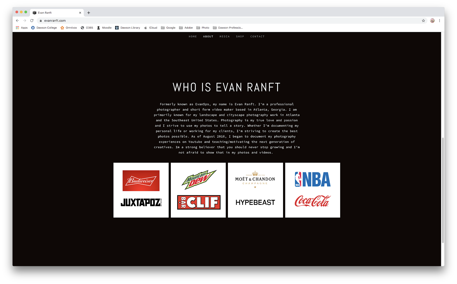
One website that I really like is this photographer called Evan Ranft.
Top
Bottom
 I really enjoy this website because of how simple and minimal it is. You have your essential tabs at the top, and not anything more to confuse you or make you lose focus and leave.
When you scroll down it has his partners and the top menu follows along as you scroll.
I like the single picture as the background as it shows that he’s a photographer.
Even the font is clean and simple
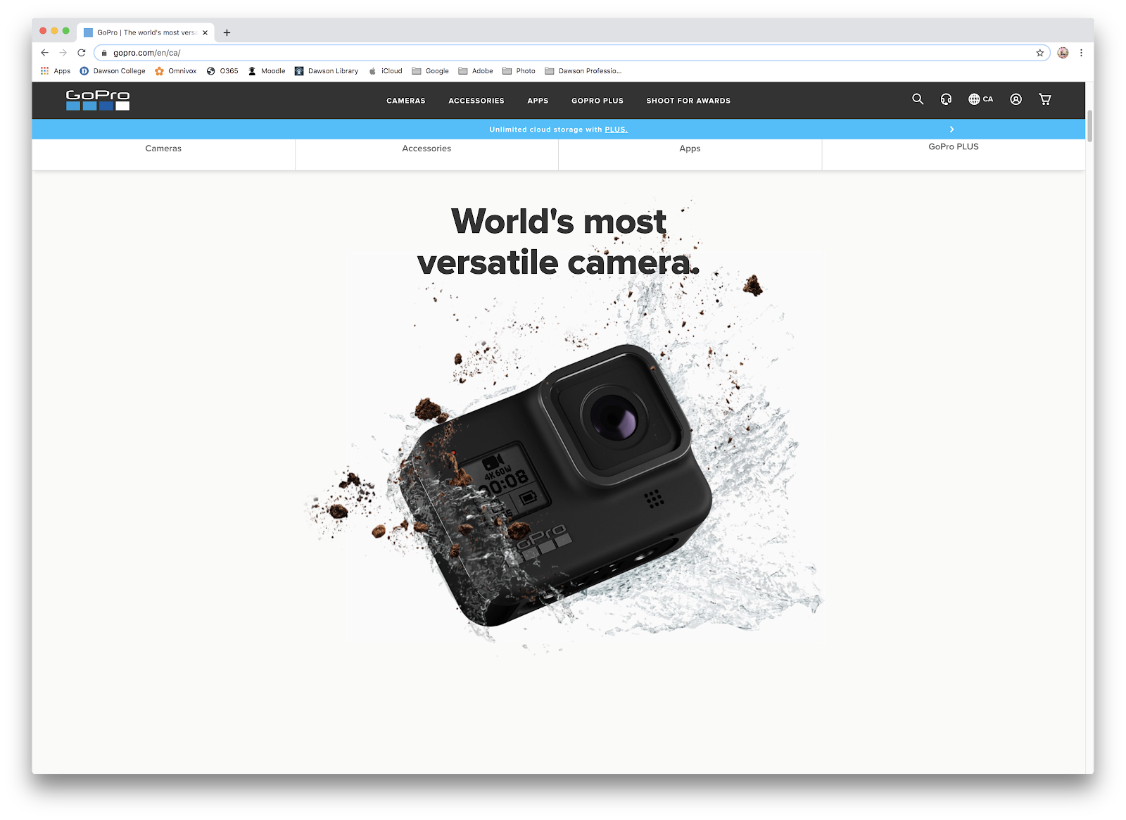
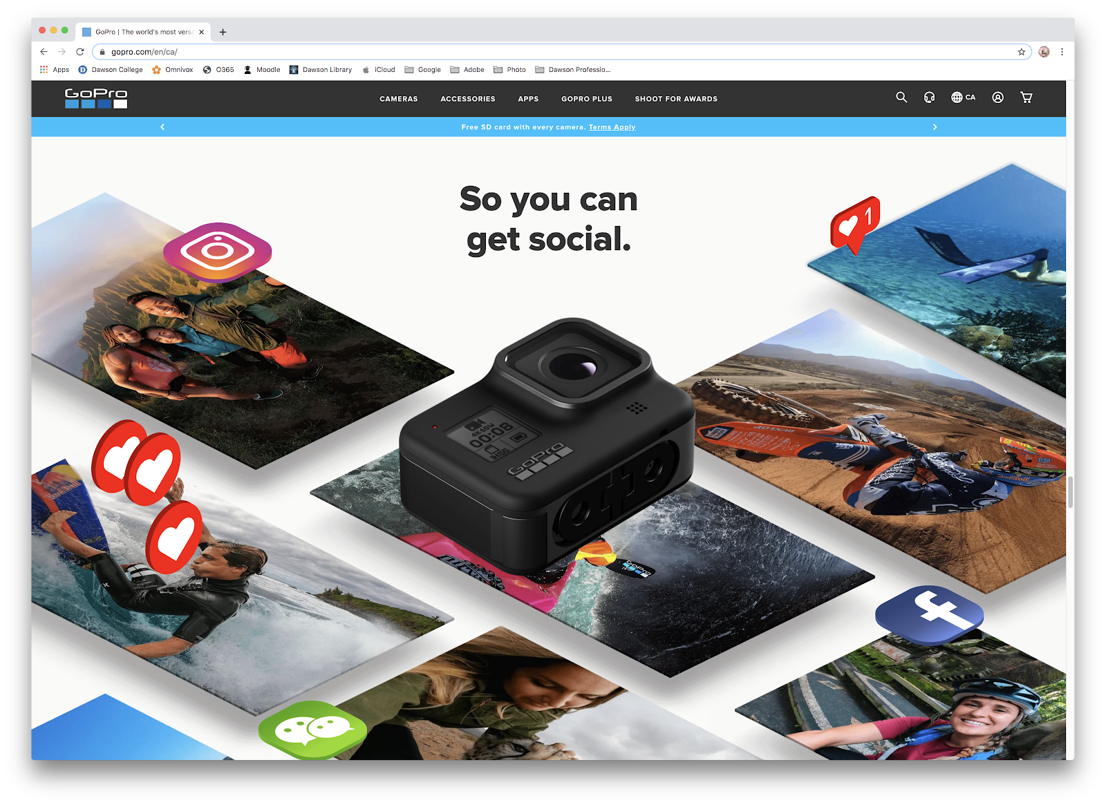
Another website I really enjoy was GoPro
Top
Middle

Lower on the page (not bottom)

The final website I find interest is Kylie Skin
Top
Middle

Bottom

I’ve never bought anything from Kylie Jenner’s skin care line or have been interested but the website alone is something that would maybe peak my interest in buying something from KylieSkin. I find the choice to have three main colours on the website to be super effective in creative a nice soft vibe about it. Having the website be the same colours as the products makes it aesthetically pleasing to look at as a whole. I also find the website gets to the point but in a different way than the others do. The page you find yourself on when you first click on it is simple and clean, as you scroll you are introduced to all the products that the company sells ( and if you want to get more specific than you can go to the drop down bars and looks specifically for eyes, or lips.) finally when you get to the bottom you are presented with important information that people look for when it comes to beauty products and then your usual stuff like socials, newsletters and contact.
For my website I wish to use Squarespace and plan to have AngelaEHarvey.com
(no caps obviously) as my domain name is AngelaHarvey.com is taken.
